Visualizing air pollution & healthcare inequality — India, Pakistan, Indonesia, Nigeria
The project began with a contradiction I noticed in global health data: countries with extremely high air pollution — India, Pakistan, Indonesia, Nigeria — often report fewer respiratory illnesses than the United States. That gap isn't a sign of cleaner air. It's a sign of who has access to a hospital, a diagnosis, a record.
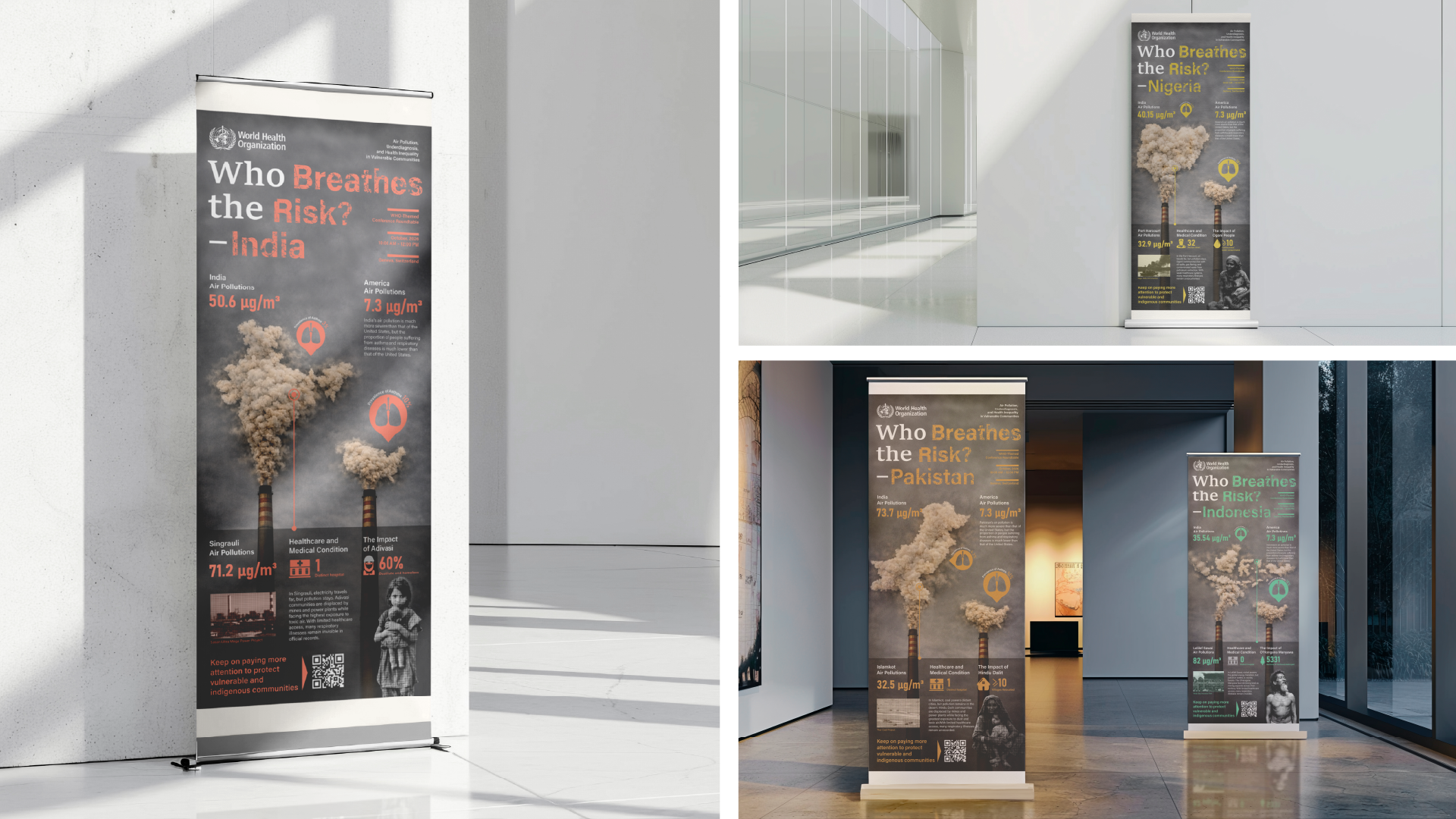
Designed as a WHO conference roll-up series aimed at policy makers and public health experts, each banner pairs a country's pollution data with the healthcare and human cost behind it — inviting viewers to question what official statistics leave out, and to see air pollution as a problem of environmental justice, not just air quality.
Working with global health data also meant working carefully: figures from different countries aren't always directly comparable, and the communities most exposed to pollution are often the same ones most likely to be stereotyped. The goal throughout was to make the inequality visible without oversimplifying the people living inside it.
Data Research
Sourced from Our World in Data, the World Bank Group, the Global Atlas of Environmental Justice, and the World Air Quality Report — cross-referencing PM2.5 exposure, asthma prevalence, income classification, and documented environmental-justice cases worldwide.
Inspiration & Color System
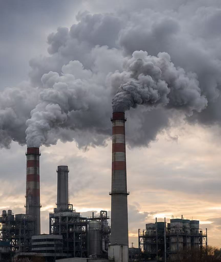
Each country's smoke plume is built from halftone dots and shaped to its map outline — turning industrial pollution into a concrete, geographic image. Every country carries its own color, chosen for its environmental association rather than decoration.
Black & Grey
{{ c.colorName }}
{{ c.assoc2 }}
Four Banners, Four Countries
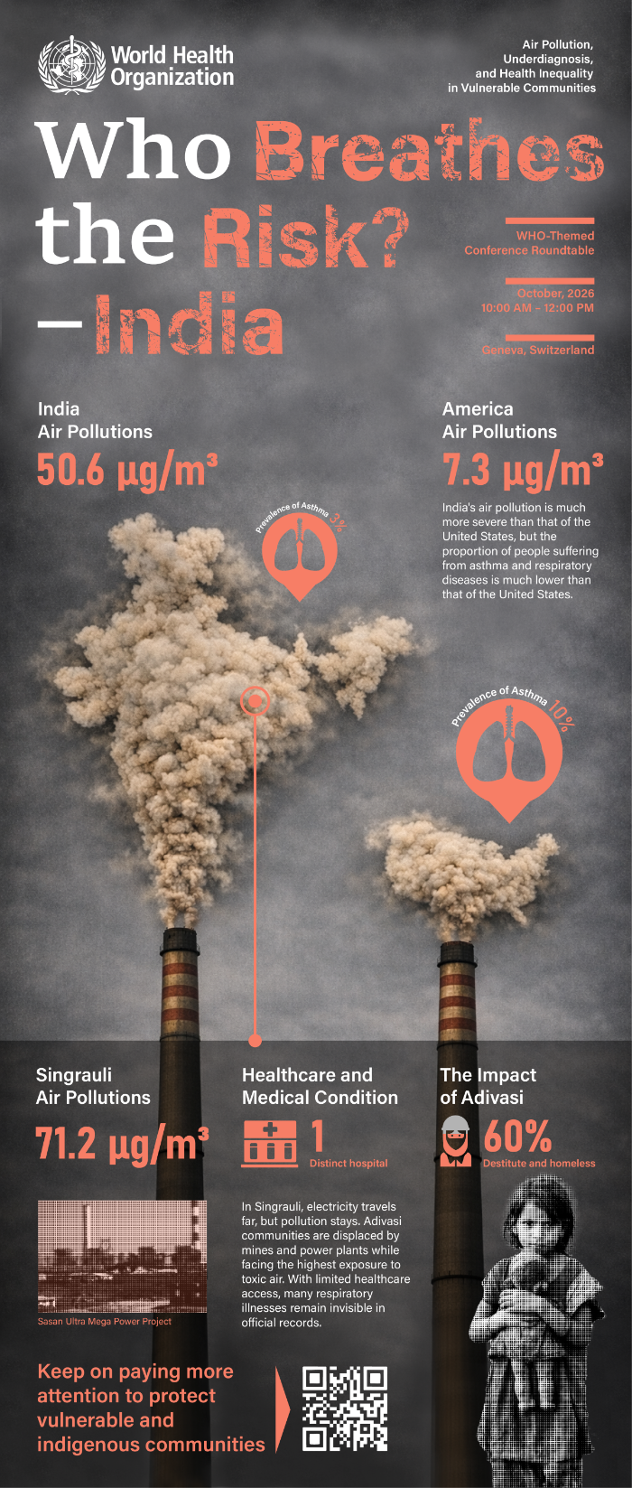
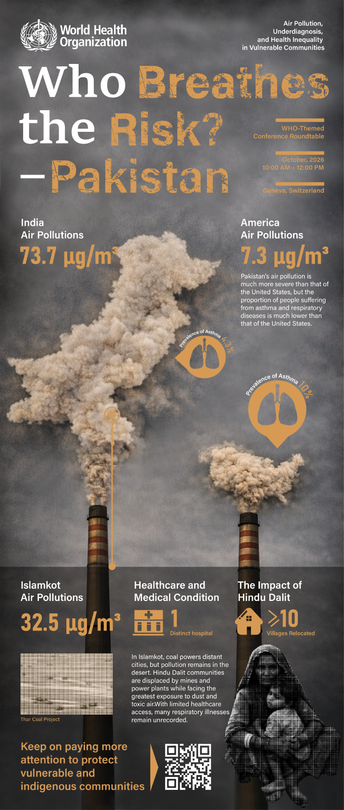
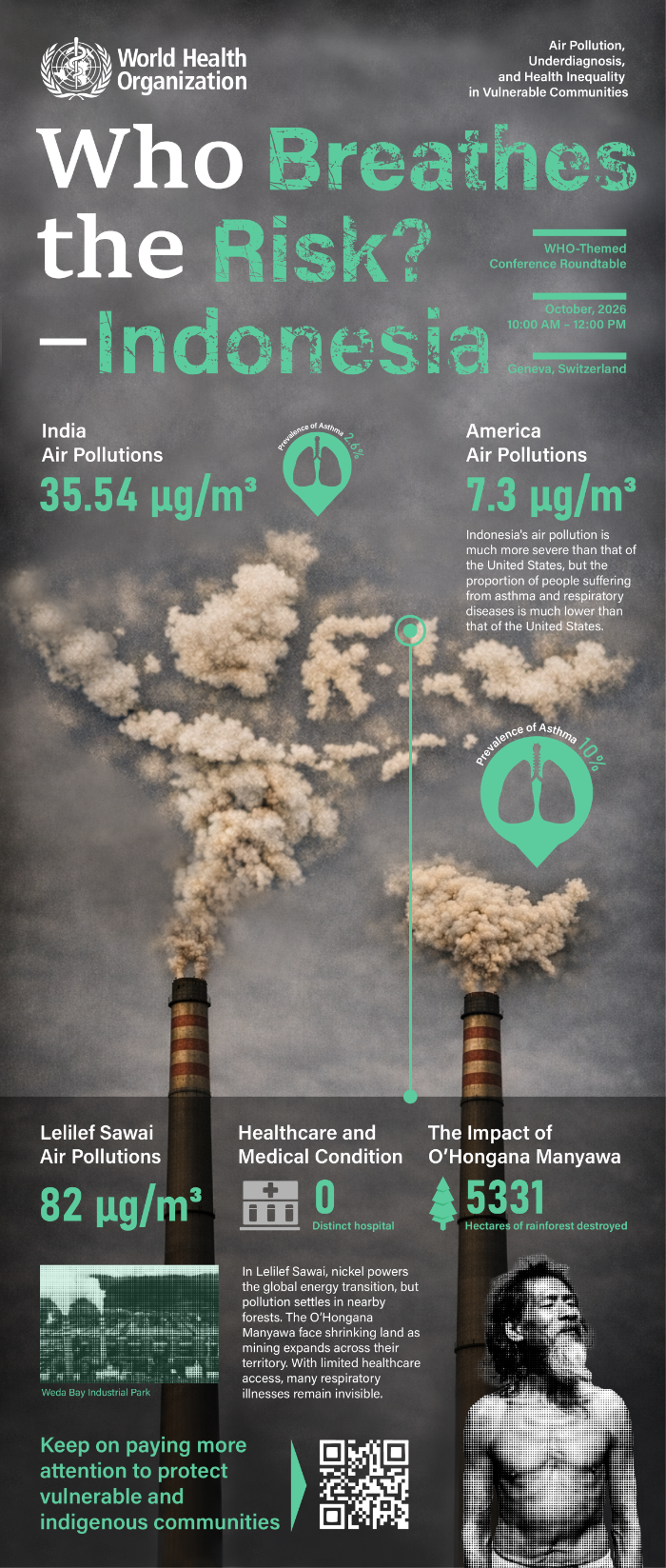
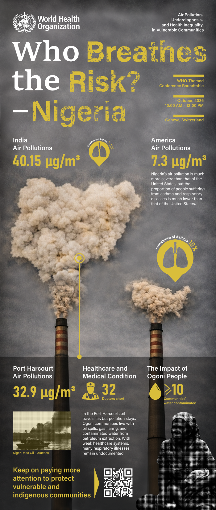
Exhibition Layout
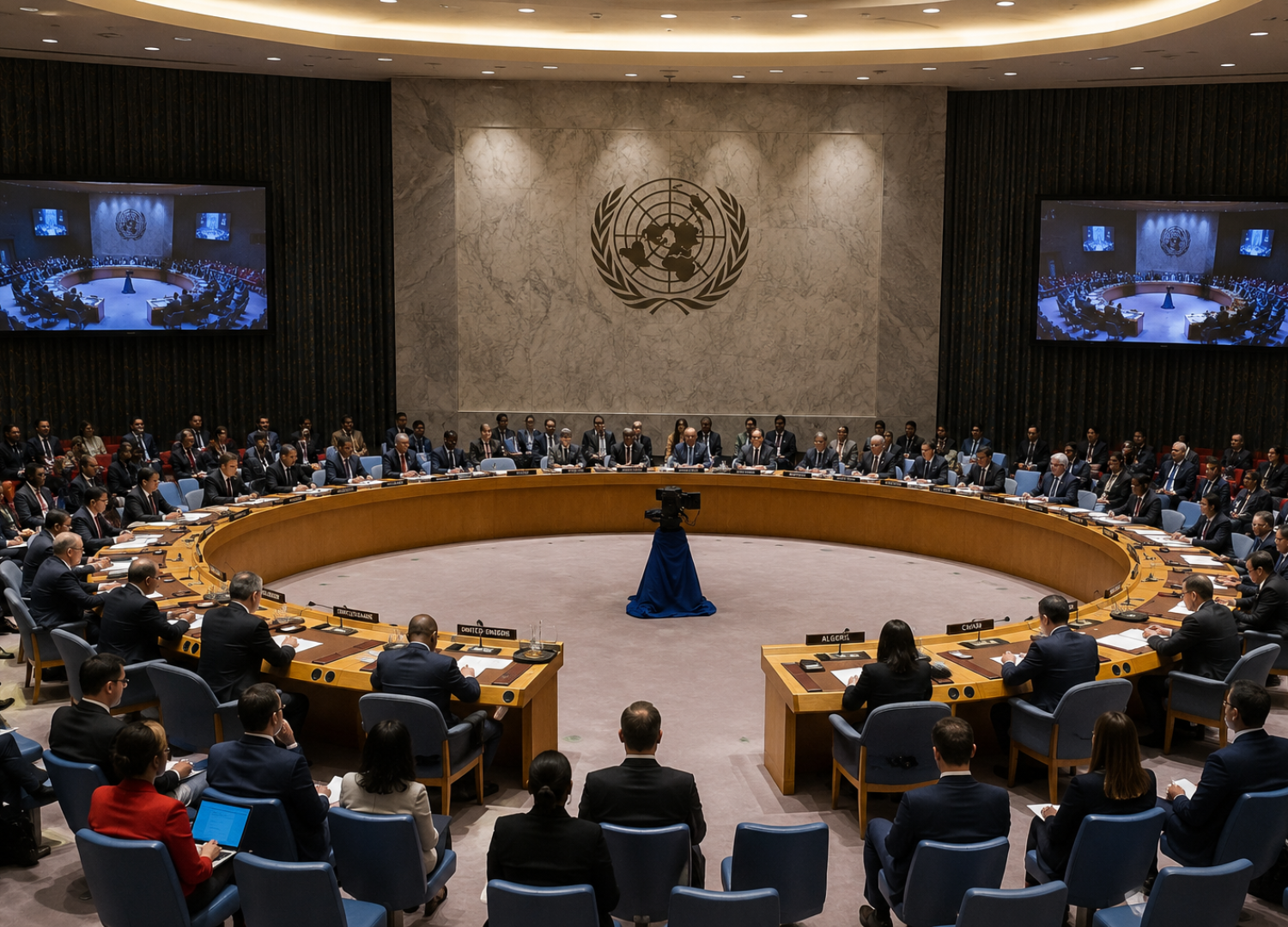
Designed for a round-table conference hall — four banners positioned around a circular seating arrangement so every entrance faces a different country's data first.
Mockups